CREATIVE|DIGITAL|ENGAGEMENT
Move over the letters · tap them · tap the dots on the i’s
CREATIVE|DIGITAL|ENGAGEMENT
CREATIVE|DIGITAL|ENGAGEMENT
The idea
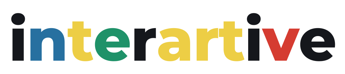
Four colours for the four things people do on Interartive — learn, create, grow, and gather live — carried by neutral letters that take the contrast of whatever they sit on. The dots on the i’s are touch points: in the interactive logo, touching one sends ripples out in all four colours, because every experience starts with a touch.
রং
Blue #2770a0n — trust, learning
Yellow #edce45t · a · r · t — creativity
Green #1f9269e — growth
Red #d53c31v — energy, live
Ink #15171cneutral letters on light
White #ffffffneutral letters on dark
Mark and favicon
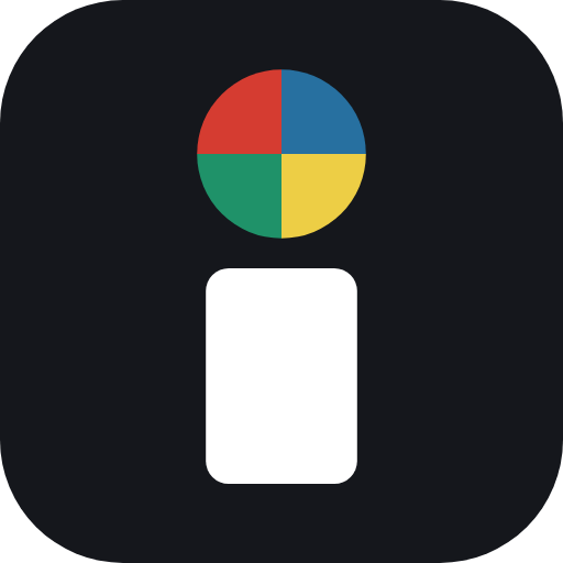
The lowercase i with the four-colour touch point. Used for the favicon, app icons, Frame View and small spaces.
Use it well
- Typeface: Montserrat ExtraBold for the wordmark, Montserrat Bold with wide tracking for “Creative | Digital | Engagement”.
- Keep the letter colours in their places. Neutral letters are ink on light backgrounds and white on dark or photographic ones (with the soft shadow).
- Give it room: at least the height of the letter “n” on every side. Never stretch, outline or recolour the coloured letters.
- The interactive logo is for screens where people can touch it: the homepage, Frame View idle screens, events and this page.
Downloads
| Interactive logo (HTML + CSS + anime.js, self-contained folder) | Open |
| Logo — original (white letters with shadow) | Download |
| Logo for light backgrounds | Download |
| Logo for dark backgrounds | Download |
| Wordmark only — light | Download |
| Wordmark only — dark | Download |
| App mark / favicon (SVG) | Download |
| App icon 512 px | Download |
| favicon.ico (16/32/48) | Download |